It doesn’t have to be easy to use

When people are specifying software one often hears the phrase ‘It must be easy to use’.

I rather think this is jumping the gun… the first and most important requirement should be more along the lines of ‘It must make the users life easier’ or ‘It must add new value to a users world’.

And if we think hard enough about it then ‘add value’ is really just an extension of ‘makes easier’… how so?

The ‘added value’ always has a goal, whether it be peer recognition, money, or sex appeal the user is still trying to achieve something by adding value to their lives and if the software enables that then it is in fact making their lives easier.

Without that (often ignored) step the product is doomed… no matter how easy the software is to use if it doesn’t make the users life easier then why are they going to use it in the first place?

This also helps explain why some dire products are actually successes. They may be an utter pain the behind to use and they may crash 50 times a day but if I take all that into account they still make my work possible or easier then I will still use them.

‘Easy to use’ is by far the secondary consideration.

Of course… once you have a product that makes the users life easier or better then ‘easy to use’ becomes much more important… after all who would voluntarily opt for something harder to use?

Oh, right, Power Users would. These folks will trade ‘easy to use’ for ‘makes my life even easier’ in a heartbeat.

Power Users seem to prefer consistency and predictability over mere ease of use. They will gladly invest hours of learning provided a) their lives get easier to use, and b) the effort is rewarded by unlocking even more potential.

Ordinary Users however will not invest hours of learning… in fact for a large majority if it isn’t obvious in a few seconds how to achieve something it is already too complex.

I’ve watched people type in a word and then click the ‘bold’ button… when nothing happens their first thought isn’t “Oh, I forgot to select the text” it’s more like “Hmmm… the bold feature doesn’t work”.

Of course what we have is a gradient of users from the most disinterested all the way up to the ‘expert power user’.

However they all have one thing in common… they are trying to make their lives easier by getting something done.

I believe this then is the baseline from which all software development must begin…

Who are the users and how does this software make their life easier?

see also

You must be logged in to post a comment.

community content (2 approved comments so far)
Click to expand

Personal Storage is Nigh
Click to expand

This is an idea that pops up every so often but I think we are close to seeing it become reality.

Stop and think for a moment about your gadgets. Maybe you have a desktop at work, one at home, a business laptop, a netbook you take on holiday, a Kindle for reading and an iPad for the couch. Possibly you’ve got an iPhone and a fridge that plays tunes in your kitchen.

As a consumer you are constantly being told that you need bigger, faster, more, better. Faster CPU’s, better graphics, longer games, more information, more storage.

But really that’s all just marketing.

I’m willing to bet that what you really want is more gratification, to be more lazy, to get the hotter girls, to have more fun.

We see from the iPhone that the multi-gigabyte HD games we have been sold on the PC for years are often outperformed in terms of fun by games targeted at small screens, consisting of a few tens of megabytes.

We watch videos on our iPads and find it fine. We watch terrestrial TV and the most annoying thing is rarely the quality of the image but more often than not the content or the impossible to follow sound.

We surf the web everywhere and almost every device lets us store bookmarks, leaving our history fragmented and broken.

We listen to audio all over the places and painstakingly replicating our music libraries from device to device. Often a track is on one device but not another, or you get two copies of it.

Every gadget we buy pushes us to have extra hard drive for extra cost.

But wouldn’t it be better to have a single device that stores all our data and allow all our other gadgets to hook up to it and access whatever is needed?

Funny enough we already have such a device.

The SmartPhone.

We carry smart phones with us everywhere, they come equipped with wireless communications, batteries, loads of Flash storage, and we are already used to charging them every night.

Imagine if you will that your iPhone has all your data on it… why then can your iPad not stream the files it needs to and from? Why can’t your fridge or your laptop?

Imagine one set of bookmarks you share everywhere, one place to hunt for that important letter, one music library to maintain.

Wouldn’t that be easier? more sensible? better for our environment?

I think so.

Sure the technology needs some work to add a little more storage, a little more battery capacity, better wireless serving. But the basics are there and as smart phone makers search for differentiating factors I’m pretty certain this is one area that will be discovered.

Personal Storage will blow away your reliance on the ‘Cloud’. Why trust a 3rd party with your data? Why put your data in place you can’t get to if the internet goes down? Why pay for storage you already have that works slower and with less reliability?

Why install your software multiple times? Why not have it on your smart phone to be pulled off and run on your other computers as needed?

This brief dalliance with software as a service will go the way of the dodo, it’s only benefit is in charging you more and making our unreliable power and internet infrastructures even more critical.

No, the future as I see it has my smart phone acting as my personal storage module and software repository and all my other gadgets as simple (potentially amazing) clients onto it.

My world, my pocket, with me everywhere.

You must be logged in to post a comment.

community content (no approved comments so far)
Click to expand

Suspended Reality
Click to expand

Running Fast in the Background, Going Nowhere

Lately I’ve been doing quite some research on the internet which means I ended up with lots and lots and lots of simultaneously open tabs.

This has 2 serious downsides… the first one is obvious: it becomes really hard to find one tab among many.

Scrunched up tags

The second one is less obvious… my browser becomes jarringly slow.
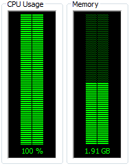
CPU Usage at max

The slowness really takes over with complex sites all running lots of JavaScript tickers, Flash animations, music players, etc.

This is particularly annoying since these background tabs are, without exception, utilising my horsepower to do stuff I can’t see and consequently don’t care about.

This led me to thinking… why? Why do we allow tab processes to run in the background?

Here are the things I came up with:

  1. Downloads
  2. Uploads
  3. Streaming music
  4. Sites like GMail and RSS readers
  5. Intensive long running processing tasks

And you know what? Nothing I was looking at fell into one of these categories.

Background processing in tabs has only two ways to let you know anything is going on:

  • By playing audio
  • By changing the title of the site (and then only if the current tab is big enough to show any text).

Now I personally never want more than one tab to be playing audio at a time… so allowing all tabs to play audio seems like a bad idea from the get go.

Download, download, and download again

I’m a iPhone fan… I love the number of daily tasks I can accomplish with the small pocket wonder (more about this another time), especially the ability to read web pages whilst on the go.

However, coverage around my area is spotty at best, which means I’m often out of touch with a data signal.

iPhone searching for signal

This frequent disconnection throws one of the inefficiencies of the web into stark relief. Browsers always go back and re-download a page when viewing the users history… so even if I’ve visited the page just a few minutes before, if I no longer have an internet connection, I can’t view it again.

This appears to be a question of convenience… but there is another, darker, side to this throwaway approach. When I’m doing a body of work and make a note of a particularly great URL I can have zero confidence that tomorrow I will be able to return to that link and find the same content. If it is a blog it may even be that 10 minutes later the content will no longer be available at the same URL.

It seems to me that it would be much much better if browsers kept the content they downloaded in a giant cache and only fetched a new copy on user demand. In this way all the content I’ve viewed (regardless of the desires of the webmaster) would be available to me again and again.

Of course… this leads to an issue of space usage… so presumably the oldest pages would have to slowly fall out of the cache, but with today’s giant hard drives and massive flash memory I bet we could store a large chunk of our history.

This would change the approach to bookmarking also… when I bookmark a site it would (apart from getting listed in my bookmarks) be flagged as ‘not to discard’, ensuring that whenever I return to the bookmark I can still read the content I was interested in.

Finally keeping content locally would truly allow me to annotate the pages that I was viewing (think something like the comment reviewing tools in MS Word) and build a body of research on a topic that had some real value and context.

Revisionist History

Something that has driven me nuts for years is the revisionist approach to web browser histories.

When I visit a site and navigate through some links I can use the ‘back’ button to go back in time and the ‘forward’ button to come forward again. However, if I go ‘back’ and then follow a new link the entire previous future is thrown away in place of the new future. In the graphic below the ‘red’ route (top) is completely forgotten.
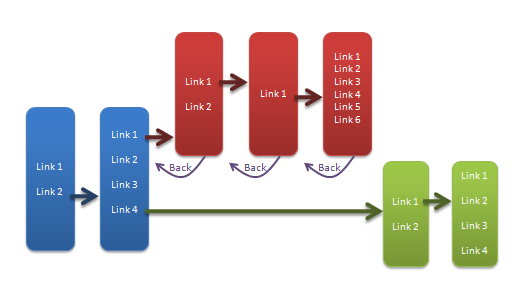
Browser timeline

But what if just wanted to check a quick fact and then return to where I was? Yep… I have to go ‘back’ and then painstakingly retrace my previous steps one link at a time.

The same occurs when I open a link in a new tab… *bang* the history from the previous tab is not carried over… there is no way for me to find out how I came to have that tab open.

There is no real technical reason for this… computers are completely capable of remembering the full history (in fact it is little more than a simple tree) and also of copying it between tabs.

The ‘back’ button works well, but in my opinion the ‘forward’ button, and new link navigation behaviour is horribly broken.

The forward button should remember all the routes you have browsed and (whilst it may default to the most recent) should offer then the choice of which route to follow when going forward.

Putting it together

With those three thoughts formed it seems that they are a perfect match.

Jigsaw coming together

Imagine a world in which a browser stores our full history (not just the current timeline) with all the content of the pages, then when the user navigates away or changes tab also stores the current execution state of the scripts in the cache.

Suddenly our browser only has to run one set of scripts and keep one page loaded in memory at any given time. We can return at will to pages we have seen before regardless of whether we have an internet connection available, we can annotate and cross-reference pages, and we can implement a history browser that lets us see multiple navigation routes. We could even display the users history in a revision tree much like we use in version control.

Downsides

As with every idea this one is not without its downsides.

Chief among these are the lack of backward compatibility with the current browser model and plugins, but there are a bunch more:

  • Site owners would see a dramatic reduction in ‘hits’.
  • Advertisers would ship less ‘fresh’ adverts.
  • It would require a new UI to allow certain sites to be flagged as ‘background’ tasks (e.g. streaming audio sites, gmail) which would allow processing when hidden.
  • Users would probably need some kind of UI element reminding them that the content they were seeing was, possibly, not the most up-to-date content on the site.
  • There would need to be a clear separation of ‘upload’ and ‘download’ activities so that these did not get suspended by tab backgrounding (although I think for the most part browsers already do this).

Conclusion

I could see this being a much nicer web experience… but sadly inertia probably means it won’t come to pass.

see also

You must be logged in to post a comment.

community content (no approved comments so far)
Click to expand

Folders vs Labels
Click to expand

An endless gripe with Gmail has been that it uses labels in place of hierarchical folders to organise mail. This is great in some ways since we have all encountered the situation where a mail appears to belong in more than one folder, but irritating in that it isn’t possible to keep a nested set of categories for your mail.

Labs to the rescue

A recent ‘labs project’ from Google has attempted to solve this with the use of specially formatted labels – i.e. any label with a slash in it can appear like it is in a folder.

For example if we wanted a simple folder structure as follows:

We could create 4 labels:

  • People
  • People/Dave
  • People/John
  • People/Karren

And the Google “Nested Labels” Labs extension will make this show up as

Complete with the little collapse folder icon (which works) and all the expected label colours.

Seems like the problem has been solved wonderfully right? Wrong!

Fundamentals

Unfortunately this is what our American brothers would refer to as ‘lipstick on a pig’… it’s a cosmetic fix that does nothing to alleviate the fundamental problem.

Imagine if I rename the ‘People’ label to ‘Friends’…

Uh oh. That’s very unlikely to be the result I wanted and highlights the point that all this is still just visual trickery.

In addition if you have the option to display labels in front of all the e-mails you receive you will see the full label (folder, slashes, and all) on every e-mail.

So in my opinion this lab, although really handy, rather misses the point.

Sub-classification

What we are looking for is sub-classification and being able to treat groups of mails as if they were one item. This can, I think, be achieved in a relatively simple solution.

We need only get a little bit Meta on our labels. If we could apply labels to labels as well as to mail we would be sorted.

Imagine I have 10 mails labelled ‘John’ and 5 labelled ‘Mike’. Now all I have to do is create a ‘Friends’ label and apply that to the labels ‘John’ and ‘Mike’ and presto… all the benefits of folders with the added benefit that I could also label ‘John’ with a ‘Colleague’ label.

No mail duplication, no hard folders, multiple sub-categorisation, and the ability to manipulate mails as grouped items. Simple.

Going further

But why stop with mail? This can also be done for Contacts, Tasks, Documents, Events, etc.

In fact, why maintain separate sets of labels?

Imagine I have a group of Contacts called ‘Friends’ why do I need to manually create a label in my mail called ‘Friends’ and then create filters to add that label to all the mail from my friends?

It doesn’t seem a big step to have this label automatically applied.

And the benefit of a common label system? If one of my ‘friends’ becomes an ‘enemy’ then all the material related to that person moves automatically simplifying my filing and admin tasks.

Hiding via settings

Of course sometimes I will have labels related to one thing that I don’t want to show up everywhere – a common labels system could generate a lot of labels) – but as is already demonstrated in Gmail this is actually just a question of display and could be cleanly handled by extending the ability to ‘show/hide’ labels to the ability to ‘show/hide for each section’.

Auto filtering

Finally why can we only apply filters to mails? I should be able to set up filters for my documents, contacts, appointments, etc as well.

Imagine I’m working at a company (ABCorp) and I want to keep all the information about that company labelled together – it should be possible to create a filter that labels any item (document, mail, contact, etc) that contains the word ABCorp automatically.

So how do we make this?

At this point we have a unified simply filing system that fulfils all the benefits of labels, folders, filters and has none of the drawbacks.

Unfortunately it requires Google to modify their backend to allow application of labels to labels and it requires deep integration of their disparate services. This is no small UI fix.

I believe it is likely it could be done without breaking existing data but without access to Googles core systems it’s impossible to know.

So sadly… after you’ve slogged all the way down to here… this probably isn’t something we are going to see any time soon 🙁

see also

You must be logged in to post a comment.

community content (2 approved comments so far)
Click to expand

Conflate with care
Click to expand

One of the worst user interface design errors is the conflation of two unrelated concerns. Unfortunately it is depressingly common.

Take for example Back and Up. Frequently these are conflated into a single button leading to unexpected user behaviour. This is currently bugging me on my Android phone… I use an app that opens a screen that then sends me to my e-mail, I press ‘Back’ expecting to go back to the app but instead the ‘back button’ is overloaded to mean ‘up to parent’ by the mail app so I actually end up in the inbox. It may seem a small thing but believe me it is absolutely infuriating.

Unfortunately for designers precisely the converse is also true… one of the best UI design ideas is to conflate related ideas. Yes, mutual contradiction at work.?

Consider e-mail and facebook messaging, both are basically the same and wrapping them all up in the same ui would make most users pretty happy.

The challenge for the designer then is to locate ideas that seem related not only to the designers of the world but to everyone who will pick up their creation. When they succeed the user sees the world as simpler, more obvious, and less stressful. When they fail the UI seems to be a nightmare to use, a frustration, and often reason enough to seek alternatives.

Moral: Conflate with care!

see also

You must be logged in to post a comment.

community content (no approved comments so far)
Click to expand

Looking back on previous work
Click to expand

So, over the years I’ve done some interesting work (or at least some time consuming stuff 😉 ) and I thought it might be interesting to gather a few of those items together on my new site, to begin with I’d like to highlight a couple of my early web designs.

C&W Creams

From 2004 this design was for a small American family business selling a special moisturiser to the female market. The site was a simple no-nonsense construction using css based navigation (at the time that was relatively cool, nowadays no-one would consider it anything special… how times change) consisting of 7 pages.

TaxTime

Keeping the minimalist information driven theme I also created this framework for an American tax office, unfortunately this wasn’t what they were looking for at the time so now it exists only as this mock up. I guess you win some and loose some…

So there you have it, a simple post with a couple of designs in it… if you like to see this sort of thing do let me know and I’ll see what I can do.

see also

You must be logged in to post a comment.

community content (no approved comments so far)
Click to expand
Design and Content © Copyright Duncan Kimpton 2010