Quarantining failing tests with Jest

Sometimes a test fails because a subsystem isn’t yet ready, the test is valid but failing. When that happens it sucks to have to comment out the test in order to keep the build green whilst fixing the subsystem. I’d rather be able to mark the test as “known failing” and then carry on.

Bamboo allows for this with the concept of “quarantined” tests which works really well… on a build server.

But that doesn’t help at all when it’s a test on your local dev system 😒

Jest allows tests to be marked as ‘skipped‘ which prevents them from running, so at least progress can be made with a “known broken” test. However, should you actually succeed in fixing the subsystem nothing will let you know that that broken test is now working. If you’re like me there’s every chance you’ll commit your now working subsystem but forget to go back and re-enable the skipped test.

You can also mark a test as ‘todo‘ and get a nice little indication in your test output that there is still work to be done, but that test can’t have any code 🤔

Given that there is an outstanding feature request in the jest issue tracker, I’m clearly not the only one that wants such a thing (phew! it’s good not to be too weird).

So, in order to keep working, I came up with a suitably hacky workaround 😁

I created a ‘quarantine’ function that can be appended to test/it that makes the test show up as a todo as long as it is failing, and show up as a failure if it unexpectedly passes.


jest-quarantine.js

test.quarantine = function (description, func) {
  describe("in quarantine", () => {
    try {
      func()
      test(description, () => {
        const e = new Error("[" + description + "] was expected to fail, but it passed")
        e.name = 'Quarantine Escape'
        throw e
      })
    } catch (e) {
      test.todo('fix ' + description)
    }
  })
}

Then I added this to my jest config like so

jest.config.js

export default {

...
  setupFilesAfterEnv: [
    '<rootDir>/jest-quarantine.js',
  ],
}

which of course is included in the jest command line as

"jest  --config=./jest.config.js

And now I can just write

test.quarantine('this test is not ready yet, () => {
  expect(true).toBe(false)
})

And get Bamboo-like quarantine behaviour on my local dev box.

Ideal? no. Great code? also no. Useful? For me it is 😎 maybe it will be for you too.

Comments are Closed.

community content (no approved comments so far)
Click to expand

Building a workshop
Click to expand

Having become frustrated with building stuff on the dining room table, I finally decided to outfit a decent workshop. It’s a small place; so the workshop won’t be anything too grand, but any space to work is better than no space.

I’ve been at it for a bit now, and I keep forgetting all the effort that has gone into it. To be able to look back and remember, I thought it would be fun to throw together a timeline with what photos I have.

photo of wiring inside shed wall

First, of course, was to add some electrics and tune up the insulation. This involved stripping out the interior walls, wiring, insulation, and then putting it all back together. Painting the walls and ceiling. Then, finally, adding the switches and sockets. Sadly I didn’t take many photos. In fact, I have one somewhat fuzzy one, but at least it serves as a bit of a reference.

Next up was the floor, it was bare concrete and somewhat crumbling, so I filled it in and painted it. It looks lovely, but it was rather an error. Once I started using the workbench (more on which later), I discovered that the painted surface is stupidly slippery. At some point, it’s going to need a new topcoat with something grippy in it… but by now, of course, the shed is full of stuff.

Here it is after the first coat.

photo of painted floor

Clearly, the walls by this point had taken a bit of a beating. Don’t worry, they got a fresh coat of paint. Strangely I didn’t take any pictures of that either.

The next project was to add some ventilation. A complex problem because the only logical extraction point was above the window, which interfered with the shelving I wanted to build there. Eventually, I ended up with some plastic ducting to the extractor fan, then a wooden box duct to the shelf, and some ventilation slots in the shelf. Oh, not forgetting, of course, the second set of ducting that leads down to some inlets just below the bench… which I plan to use eventually for the dust extractor system. One day…

The basic ducting:

photo of air duct

The structure of the wooden ducting, showing the top shelf:

photo of wooden air duct internals

The outer case, which directs the flow from the lower shelf:

photo of wooden air duct external

A quick break to paint the window frames before I blocked off the access with the shelf:
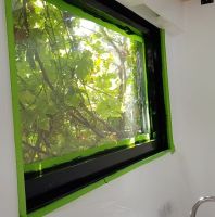
photo of painting the window frames

And finally, the lower shelf, showing the ventilation slots:
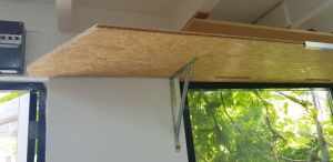
photo of ventilation slots under shelf

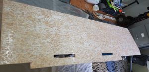
The OSB didn’t really fit in with the clean black and white colour scheme, not to mention the number of times I got a splinter handling it. For ages, I wanted to try resin coating something… this seemed like a great chance to kill two problems. So over several days, I coated it repeatedly with a white epoxy resin. This stuff turned out to be really challenging to get a good finish on 🙁 Luckily, it’s a shelf in a workshop… so I can accept something less than perfect.

About to apply the resin:

photo of shelf before resin is applied

An intermediate coat:

photo of shelf after one coat of resin

Mounted, with the last coat… came up quite shiny. After this, I went back and filled the air gaps with silicone, but again I didn’t photograph it, apparently.

photo of shelf after final coat of resin

I took a short break to paint the support brackets, it just looks better and if I’m going to spend some quality time out here… why not?

Finally, the shelf is mounted. Clearly, I’ll need to do something about the edge, probably an aluminium casing. Still, I’m not sure how it’s going to join into everything else yet… so, for now, it can look a little rough.
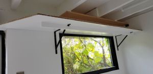
photo of shelf installed

The extractor fan doesn’t shift as much air as I’d like, but a proper unit would have taken up too much space. I had to settle for something being better than nothing here.

Phew. Ventilation, upper shelving, and some nice fresh paint. Time to tackle the workbench…

At this point, I thought I could just buy a bench and be quickly on to other projects. But, of course, life is rarely that simple. First up, it didn’t stand level. Seems that only the more expensive models had the adjustable feet. So, it was out with the angle grinder to cut the legs to length.

After chopping off these little bits:

photo of remains of table legs

The frame stood pretty darn level, good enough that I didn’t imagine myself being able to get it any better.

photo of installed table frame

But then I realised I couldn’t fit the wood-working vice I’d bought. It mounts under the bench, but the steel frame got in the way. So, I had to fudge it.

First, I mounted the front plate to the steel frame:

photo of vice faceplate on steel frame back

photo of vice faceplate on steel frame front

Then built a bracing structure front to back across the frame:
photo of vice bracing structure

photo of vice bracing structure being glued

And finally hollowed out the benchtop so that it could be fitted over the new fixings.

photo of cutouts under the bench top

photo of underside of mounted bench top

And, naturally, failed to take any pictures of the finished job.

Never mind, I got right to work using the bench. Oh, how good it is. Working on a bench is so much more enjoyable than trying to clamp things with my knees, or work on the glass-topped dining room table!

Of course, the first thing I did was to make some mountings so I could put some of my most used tools up on the wall. It’s a bit of an ongoing project still.
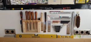
photo of tool wall

Having got these tools up, I then made something of an expensive error. I concluded I needed lots more shelving in the workshop. Tools and parts are piling up on the floor. So I ordered some fine sawn wood… or at least I thought I did. Turns out I mistranslated and ordered a massive pile of rough sawn wood. The wood is lovely, but I’m really not set up for processing it.

Just some of the wood:

photo of a big pile of wood in the shed

More of the longer bits laying down the back of the dining room:

photo of a pile of long planks in the house

I started attacking it with my #5 plane, it works, but it’s painfully slow. Not to mention bloody hard work! I tried sanding it with a very coarse grit belt for the belt-sander. Again, it works, but it is crazy slow and loud – not ideal for an inner-city location. So I built a crude router-sled and machined down a couple of beams. This is also slow, and exceedingly hard to get right. The beams are longer than the workbench, so I have to do it in multiple phases, and getting the cutting depth to accurately match up is challenging. Arg.

Working two beams at once with the router-sled:
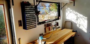
photo of the router sled

Sooner or later I’ll probably have to buy a thicknesser, I’m just not sure where to use it. The workshop isn’t really long enough.

For now, the most effective solution is the hand plane. It might just take a decade or two to finish the job 🙂

One machined beam showing the tongue:

photo of a beam tongue and grove

photo of two beam parts assembled

see also

Comments are Closed.

community content (no approved comments so far)
Click to expand

WordPress Update
Click to expand

I’m not sure whether to be impressed or scared by Googles latest achievement. They sent me a mail to let me know this site was running a vulnerable version of WordPress!

So, it was clearly update time!

I was settling in for a full day of pain, yet amazingly a couple of button presses later and we are back up with a new version of PHP and the latest WordPress version.

Go WordPress 😀

see also

You must be logged in to post a comment.

community content (no approved comments so far)
Click to expand

Investigating Foundations
Click to expand

Some eight years back I moved to the Netherlands with my job and full of youthful enthusiasm set about buying a house.

Unfortunately one little tiny teeny thing escaped me… the value of having a surveyor check that the place I was going to buy was structurally sound!

Oops!

So here we are in 2012 facing at the very least a major renovation and with the possibility of needing the foundations underpinning.

Being an engineer I like to tackle the problems from the root upwards so the foundations are the obvious first place to start. After visiting the local archive office it turned out I was unable to find any drawings or other information about the actual foundations of the house other than that they were wooden poles.

Luckily I did find a company (wareco.nl) who would, for an exorbitant fee, come and investigate the state of the foundations.

Last week a man rang my bel at 7:45am… he was here to begin digging a whole in front of my house to expose the foundations.

Well, unfortunately at that time of the morning almost no one had left for work so, with this being a narrow street, there were cars and vans parked all across the front of the place… work would have to wait.
Work begins

By 8am said man was getting agitated about the slipping schedule so I began to ring on doorbells and ‘meet’ the neighbours. None of whom seemed overly happy to have a rumbling digger just outside their window that early in the morning. On the other hand they were really helpful and wanted to chat about the works and their experiences of foundations.

Often I hear people around saying that the Dutch are not friendly and won’t talk or help but I’m just not finding that to be the case.

Anyway, it worked, 20 minutes later we had cleared 5 parking spaces and we could begin digging. Of course, this being holland, it had begun to rain in earnest again so it wasn’t exactly an ideal environment to be digging holes in the street so when I say we… I mean the two contractors began digging whilst I cowered in the doorway staying dry. Ah, so that is the benefit of paying someone else to do the work 🙂

Haarlem appears to be built on sand over a thin layer of clay, a layer of peat, and then yet more sand. And it’s below sea level. What a wonderful spot to try and build houses!

To get around the lack of solid ground the builders sank long wooden poles deep into the ground until they found firmer earth (I’m told by a Dutchman that they don’t actually reach the bedrock, just dense enough earth to be stable) and then built on top of.
Standing on Poles

Well, when our digging man had the hole deep enough that he couldn’t see out anymore he finally reach the foundation poles… they stop 1.8m below the surface.

On top of the poles a long wooden beam is laid and on top of that the walls are built. That’s an awful lot of wall that is underground… must have been an impressive feat for the men building this back at the turn of the 20th century (1901 to be precise).

A bit more digging and he was able to clear the earth from under my wall and put his arms all the way around each of the poles. So once again the front of my house was indeed standing on nothing but the poles.

It appears that there are four poles under the front wall and four under the back wall and a couple (somewhere between two and four… the man wasn’t sure) under each of the side walls.

Once they had exposed 3 of the poles 2 more guys turned up to do the investigation. The first shocker was that one of them was wearing clogs! Amazing… I never really believed that people actually used them until now.
Clogs above a hole

OK, so they punched a bunch of holes in the wood with a spring loaded bar and measured how deep it penetrated, they took lots of photos and measurements, and then they took samples. I was shocked to see how much wood they cut away (a big chunk chiselled off and a core sample from each of the poles). And that was it. They take the samples back to the lab for analysis and send me a report in a few weeks time.

The hole was quickly filled back in and by 3pm it was all over. Obviously I took lots of pictures and you can see more of them and in larger size over in my House Foundations Gallery.

You must be logged in to post a comment.

community content (no approved comments so far)
Click to expand

It doesn’t have to be easy to use
Click to expand

When people are specifying software one often hears the phrase ‘It must be easy to use’.

I rather think this is jumping the gun… the first and most important requirement should be more along the lines of ‘It must make the users life easier’ or ‘It must add new value to a users world’.

And if we think hard enough about it then ‘add value’ is really just an extension of ‘makes easier’… how so?

The ‘added value’ always has a goal, whether it be peer recognition, money, or sex appeal the user is still trying to achieve something by adding value to their lives and if the software enables that then it is in fact making their lives easier.

Without that (often ignored) step the product is doomed… no matter how easy the software is to use if it doesn’t make the users life easier then why are they going to use it in the first place?

This also helps explain why some dire products are actually successes. They may be an utter pain the behind to use and they may crash 50 times a day but if I take all that into account they still make my work possible or easier then I will still use them.

‘Easy to use’ is by far the secondary consideration.

Of course… once you have a product that makes the users life easier or better then ‘easy to use’ becomes much more important… after all who would voluntarily opt for something harder to use?

Oh, right, Power Users would. These folks will trade ‘easy to use’ for ‘makes my life even easier’ in a heartbeat.

Power Users seem to prefer consistency and predictability over mere ease of use. They will gladly invest hours of learning provided a) their lives get easier to use, and b) the effort is rewarded by unlocking even more potential.

Ordinary Users however will not invest hours of learning… in fact for a large majority if it isn’t obvious in a few seconds how to achieve something it is already too complex.

I’ve watched people type in a word and then click the ‘bold’ button… when nothing happens their first thought isn’t “Oh, I forgot to select the text” it’s more like “Hmmm… the bold feature doesn’t work”.

Of course what we have is a gradient of users from the most disinterested all the way up to the ‘expert power user’.

However they all have one thing in common… they are trying to make their lives easier by getting something done.

I believe this then is the baseline from which all software development must begin…

Who are the users and how does this software make their life easier?

see also

You must be logged in to post a comment.

community content (2 approved comments so far)
Click to expand

Personal Storage is Nigh
Click to expand

This is an idea that pops up every so often but I think we are close to seeing it become reality.

Stop and think for a moment about your gadgets. Maybe you have a desktop at work, one at home, a business laptop, a netbook you take on holiday, a Kindle for reading and an iPad for the couch. Possibly you’ve got an iPhone and a fridge that plays tunes in your kitchen.

As a consumer you are constantly being told that you need bigger, faster, more, better. Faster CPU’s, better graphics, longer games, more information, more storage.

But really that’s all just marketing.

I’m willing to bet that what you really want is more gratification, to be more lazy, to get the hotter girls, to have more fun.

We see from the iPhone that the multi-gigabyte HD games we have been sold on the PC for years are often outperformed in terms of fun by games targeted at small screens, consisting of a few tens of megabytes.

We watch videos on our iPads and find it fine. We watch terrestrial TV and the most annoying thing is rarely the quality of the image but more often than not the content or the impossible to follow sound.

We surf the web everywhere and almost every device lets us store bookmarks, leaving our history fragmented and broken.

We listen to audio all over the places and painstakingly replicating our music libraries from device to device. Often a track is on one device but not another, or you get two copies of it.

Every gadget we buy pushes us to have extra hard drive for extra cost.

But wouldn’t it be better to have a single device that stores all our data and allow all our other gadgets to hook up to it and access whatever is needed?

Funny enough we already have such a device.

The SmartPhone.

We carry smart phones with us everywhere, they come equipped with wireless communications, batteries, loads of Flash storage, and we are already used to charging them every night.

Imagine if you will that your iPhone has all your data on it… why then can your iPad not stream the files it needs to and from? Why can’t your fridge or your laptop?

Imagine one set of bookmarks you share everywhere, one place to hunt for that important letter, one music library to maintain.

Wouldn’t that be easier? more sensible? better for our environment?

I think so.

Sure the technology needs some work to add a little more storage, a little more battery capacity, better wireless serving. But the basics are there and as smart phone makers search for differentiating factors I’m pretty certain this is one area that will be discovered.

Personal Storage will blow away your reliance on the ‘Cloud’. Why trust a 3rd party with your data? Why put your data in place you can’t get to if the internet goes down? Why pay for storage you already have that works slower and with less reliability?

Why install your software multiple times? Why not have it on your smart phone to be pulled off and run on your other computers as needed?

This brief dalliance with software as a service will go the way of the dodo, it’s only benefit is in charging you more and making our unreliable power and internet infrastructures even more critical.

No, the future as I see it has my smart phone acting as my personal storage module and software repository and all my other gadgets as simple (potentially amazing) clients onto it.

My world, my pocket, with me everywhere.

You must be logged in to post a comment.

community content (no approved comments so far)
Click to expand

Using Generic Types for MVVM
Click to expand

The MVVM pattern seems to have become the defacto standard for implementing cool WPF applications.

Rob Eisenberg suggested using Conventions to help enforce a separation of View and ViewModel. This to me smacks of Magic Strings which is just not nice.

Lately I’ve been playing with a different method of doing this using XAML Generics.

I’d like to share this with the community and see how you all feel about this approach.

The basic idea is that all Views should derive from a ViewBase where T specifies the type of ViewModel they should be built against.

For example:
Assume we have a ViewModel of type SomeViewModel and we want to create a view that represents it, all we have to do is create the following XAML:
<ve:ViewRoot x:Class="app.SomeView" x:TypeArguments="vm:SomeViewModel"
   xmlns="http://schemas.microsoft.com/winfx/2006/xaml/presentation"
   xmlns:x="http://schemas.microsoft.com/winfx/2006/xaml"
   xmlns:ve="clr-namespace:ViewEngine;assembly=ViewFramework"
 >
</ve:ViewRoot>

and a Code Behind file:

public partial class SomeView : ViewRoot<SomeViewModel>
{
    public SomeView()
    {
        InitializeComponent();
    }
}

And bingo… our application will use SomeView everywhere SomeViewModel occurs in the visual tree.

Because of the data binding system we can now build our view referencing the view model, so assuming there is a Title property in the view model we can write this to a label like this:

<ve:ViewRoot x:Class="app.SomeView" x:TypeArguments="vm:SomeViewModel"
    xmlns="http://schemas.microsoft.com/winfx/2006/xaml/presentation"
    xmlns:x="http://schemas.microsoft.com/winfx/2006/xaml"
    xmlns:ve="clr-namespace:ViewEngine;assembly=ViewFramework"
 >
      <Label Content="{Binding Title}"/>
</ve:ViewRoot>

No naming conventions, no DataTemplate writing, just completely transparent intent.

Framework Wire-Up

Of course this doesn’t happen out of the box and requires a framework and a little global wiring up.

Let’s start with the simple bit, wiring it up, and then get to explaining how this works behind the scenes.

To make it simple I did away with the App.xaml startup system and went back to the old static main in Program.cs approach… I have no doubt it could be integrated into the app.xaml system if needed.

[STAThread]
public static void Main()
{
    var app = new Application();
    ViewEngine.Initialise(app, Assembly.GetExecutingAssembly());
    ViewEngine.Run(new WindowViewModel());
}

Simple huh?

Framework

Of course all the magic and challenge happens in the framework itself.

The basic principle is straightforward:

  • Scan the provided assembly and find all subclasses of ViewRoot.
  • Set up mappings between the ViewClasses and their models.
  • Wrap those in DataTemplates.
  • Load the data templates into the applications root ResourceDictionary.

The rest is handled by WPF for us.

There are however a couple of challenges to using Generics in WPF that make this more complex than one might expect.

Access to Properties

Not being able to access things like ResourceDictionary properties on the children of a generic type.

Fix: Create a 2 stage derivation of ViewRoot, the first called ViewRoot and the second called ViewRoot. This allows us to use the convention in the XAML and keeps the established XAML conventions runnings.

    public class RootView<T> : RootView { }
    public class RootView : ContentControl { }

Top Level Windows

Of course top level windows cannot be derived from ContentControl and must be derived from Window so we have to introduce some special case handling.

Its own assembly

As I discovered in one of my earlier posts on XAML it is important to build the ViewEngine in a separate assembly.

View Engine

Still it’s pretty plain sailing, in fact a whole ViewEngine class can be presented here. Obviously this isn’t commercial ready but it gives you a base to play with.

public interface IView { }
internal interface IViewRoot : IView { }
public class ViewRoot<T> : ViewRoot { }
public abstract class ViewRoot : ContentControlIViewRoot { }
public class WindowRoot<T> : WindowRoot { }
public abstract class WindowRoot : WindowIView { }


public static class ViewEngine
{
    private static Application sApp;

    public static void Initialise(Application app, params Assembly[] assembliesWithViews)
    {
        sApp = app;
        CreateViewViewModelMapping(assembliesWithViews);
    }

    public static Window Run(object viewModel)
    {
        var rootWindow = CreateRootWindow(viewModel);
        sApp.Run(rootWindow);
        return rootWindow;
    }

    private static void CreateViewViewModelMapping(IEnumerable<Assembly> assembliesWithViews)
    {
        foreach (var assemblyWithViews in assembliesWithViews)
            AddViewTypesToTemplates(assemblyWithViews.GetTypes());
    }

    private static void AddViewTypesToTemplates(IEnumerable<Type> potentialViewTypes)
    {
        foreach (var potentialViewType in potentialViewTypes)
            if (TypeImplementsValidViewInterface(potentialViewType))
                AddViewTypeMapping(potentialViewType);
    }

    private static bool TypeImplementsValidViewInterface(Type potentialViewType)
    {
        if (typeof(IView).IsAssignableFrom(potentialViewType))
            return potentialViewType.BaseType.GetGenericArguments().Length > 0;

        return false;
    }

    private static void AddViewTypeMapping(Type viewType)
    {
        var modelType = viewType.BaseType.GetGenericArguments()[0];

        if (typeof(IViewRoot).IsAssignableFrom(viewType))
        {
            var template = new DataTemplate(modelType);
            var visualFactory = new FrameworkElementFactory(viewType);
            template.VisualTree = visualFactory;

            sApp.Resources.Add(template.DataTemplateKey, template);
        }
        else
            sApp.Resources.Add(modelType, viewType);
    }

    private static Type FindViewForModelType(Type modelType)
    {
        return sApp.Resources[modelType] as Type;
    }

    private static Window CreateRootWindow(object viewModel)
    {
        Type viewType = FindViewForModelType(viewModel.GetType());
        if (viewType == null)
            throw new Exception(string.Format("No View for ViewModel type: {0}",
                         viewModel.GetType().Name));

        var view = Activator.CreateInstance(viewType);
        var window = view as Window;

        if (window == null)
            throw new Exception(string.Format("Could not initialise root WindowView({0})",
             viewModel.GetType().Name));
        window.DataContext = viewModel;

        return window;
    }
}

In case you also need an example MainWindow it is straightforward:

<ve:WindowRoot x:Class="app.MainWindow" x:TypeArguments="WindowViewModel" 
    xmlns="http://schemas.microsoft.com/winfx/2006/xaml/presentation"
    xmlns:x="http://schemas.microsoft.com/winfx/2006/xaml" 
    xmlns:ve="clr-namespace:ViewEngine;assembly= ViewEngine " 
        Title="{Binding TitleProperty}" Height="300" Width="300"
        Content="{Binding ContentProperty}"
 >
    <ve:WindowRoot.Resources>
    </ve:WindowRoot.Resources>
</ve:WindowRoot>

Have fun and do let me know if you find any way to make this better…

see also

You must be logged in to post a comment.

community content (1 approved comment so far)
Click to expand

MASM Assembly in Visual Studio 2010
Click to expand

Recently I have been doing some WIn32 assembly language programming, extending a simple program with some new functionality. As the program grew in length and complexity I began to miss the syntax highlighting, project management, and debugging abilities of Visual Studio.

Googling about suggesed that it was possible to get VS2010 to do what I wanted but it really wasn’t so easy to get it all set up the first time around.

In order to save myself figuring this out again, and maybe help one of you dear readers, I’m putting a step by step guide up here.

Before you start it makes a lot of sense to install support for Assembly Language Syntax Highlighting which you can find on this CodePlex project. It’s a simple download and run installer.

Step 1 : Create a clean project

File | New | Project…

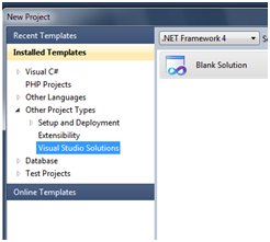
Expand the ‘Other Project Types‘ tree, Select ‘Visual Studio Solutions‘, and create a new ‘Blank Solution‘.

Create New Solution File

File | Add | New Project…

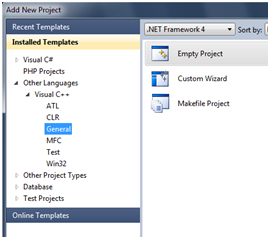
Expand the ‘Other Languages‘, ‘Visual C++‘, ‘General‘ section and create a new ‘Empty Project

Create New Project

Step 2: Acquire the MASM options.

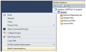
Now right click on the Project in the Solution Explorer and select ‘Build Customizations…

Menu for Build Customisations

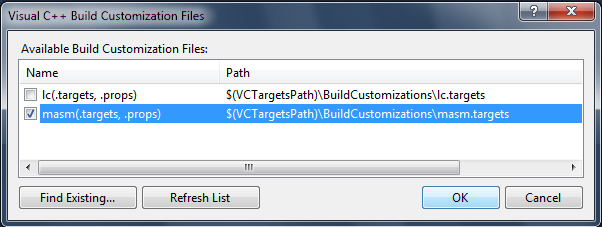
Tick the ‘masm‘ box and say OK.

Build Customisations Dialog

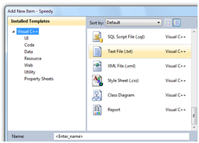
Add a new file to the project with the .asm extension by right clicking on the Project in the Solution Explorer and selecting ‘Add | New Item…‘ then ‘Text File‘. Enter a filename ending with .asm (e.g. speedy.asm). Say OK.

Create .asm File

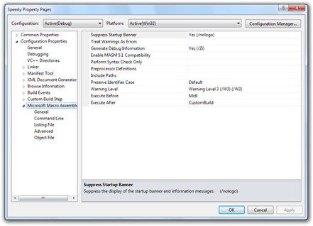
Now (and if you skipped the last steps this won’t work) right click on the Project and select ‘Properties‘. You should see a dialog like this (Note the MASM item at the bottom of the tree). If you don’t then something went wrong.

Masm Options Appear

Step 3: Configure the linker

There are a few critical things to set up in the Linker options in order to get it to work:

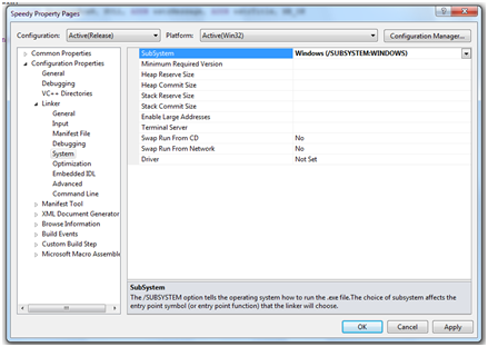
Set the following property to Windows or Console as appropriate

Configuration Properties > Linker > System> SubSystem

Select required sub system

Set the entry point to the name of your main method (as per the END directive – see code)

Configuration Properties > Linker > Advanced > EntryPoint

Specify the entry point

Step 4: Write some code & Run it

Lets write a very simple assembly language program to test this out (if you want to learn about assembler you could well try Iczelions’ tutorials and the MASM Forum.

.586
.model flatstdcall    
option casemap :none   
 
; To get unicode support 
include		\masm32\macros\ucmacros.asm		
 
include		\masm32\include\windows.inc 	
include		\masm32\include\kernel32.inc 
includelib	\masm32\lib\kernel32.lib 
 
include		\masm32\include\user32.inc 
includelib	\masm32\lib\user32.lib		
 
.data
; WSTR gets you a unicode string definition
WSTR wstrTitle, "Hello"					
WSTR wstrMessage, "World"
 
.code
 
main:
	invoke MessageBoxW, NULL, ADDR wstrMessage, ADDR wstrTitle, MB_OK
 
	invoke ExitProcess, eax
end main

NOTE: Possibly the most important thing to note here is the ‘end main’ directive. This directive must be present and the name must match the label where you expect execution to kick off and the ‘EntryPoint’ we defined in step 3. Otherwise things simply won’t work.

Hit Ctrl + Shift + B to build (or use the menus etc) and it should build and run showing a simple windows message box.

Boring but proves it’s working.

Step 5: Set break points and debug it 🙂

The really cool thing is that now you can set break points and step through your code much as you are used to doing with C++ or C# 😀

Side Note: File extensions

A small problem that you might run into is that if you move any macro definitions into their own file you need to be absolutely sure NOT to call the file .asm. If you do the linker will get horribly confused and go on and on and on about not being able to find the EntryPoint. I lost hours trying to figure that one out! Call it something .inc instead and all will be good.

The other thing is that Visual Studio seems to create a larger executable (even in release mode) than using masm on the command line. It seems to be something to do with the way it interprets the WSTR macro but I’m not 100% certain. Still if it becomes a huge issue I can always compile on the command line just before release and I get to enjoy nice debugging in the meantime.

So, there you have it. VS2010 compiling Win32 Assembler by way of the included MASM compiler.

You must be logged in to post a comment.

community content (19 approved comments so far)
Click to expand

Suspended Reality
Click to expand

Running Fast in the Background, Going Nowhere

Lately I’ve been doing quite some research on the internet which means I ended up with lots and lots and lots of simultaneously open tabs.

This has 2 serious downsides… the first one is obvious: it becomes really hard to find one tab among many.

Scrunched up tags

The second one is less obvious… my browser becomes jarringly slow.

CPU Usage at max

The slowness really takes over with complex sites all running lots of JavaScript tickers, Flash animations, music players, etc.

This is particularly annoying since these background tabs are, without exception, utilising my horsepower to do stuff I can’t see and consequently don’t care about.

This led me to thinking… why? Why do we allow tab processes to run in the background?

Here are the things I came up with:

  1. Downloads
  2. Uploads
  3. Streaming music
  4. Sites like GMail and RSS readers
  5. Intensive long running processing tasks

And you know what? Nothing I was looking at fell into one of these categories.

Background processing in tabs has only two ways to let you know anything is going on:

  • By playing audio
  • By changing the title of the site (and then only if the current tab is big enough to show any text).

Now I personally never want more than one tab to be playing audio at a time… so allowing all tabs to play audio seems like a bad idea from the get go.

Download, download, and download again

I’m a iPhone fan… I love the number of daily tasks I can accomplish with the small pocket wonder (more about this another time), especially the ability to read web pages whilst on the go.

However, coverage around my area is spotty at best, which means I’m often out of touch with a data signal.

iPhone searching for signal

This frequent disconnection throws one of the inefficiencies of the web into stark relief. Browsers always go back and re-download a page when viewing the users history… so even if I’ve visited the page just a few minutes before, if I no longer have an internet connection, I can’t view it again.

This appears to be a question of convenience… but there is another, darker, side to this throwaway approach. When I’m doing a body of work and make a note of a particularly great URL I can have zero confidence that tomorrow I will be able to return to that link and find the same content. If it is a blog it may even be that 10 minutes later the content will no longer be available at the same URL.

It seems to me that it would be much much better if browsers kept the content they downloaded in a giant cache and only fetched a new copy on user demand. In this way all the content I’ve viewed (regardless of the desires of the webmaster) would be available to me again and again.

Of course… this leads to an issue of space usage… so presumably the oldest pages would have to slowly fall out of the cache, but with today’s giant hard drives and massive flash memory I bet we could store a large chunk of our history.

This would change the approach to bookmarking also… when I bookmark a site it would (apart from getting listed in my bookmarks) be flagged as ‘not to discard’, ensuring that whenever I return to the bookmark I can still read the content I was interested in.

Finally keeping content locally would truly allow me to annotate the pages that I was viewing (think something like the comment reviewing tools in MS Word) and build a body of research on a topic that had some real value and context.

Revisionist History

Something that has driven me nuts for years is the revisionist approach to web browser histories.

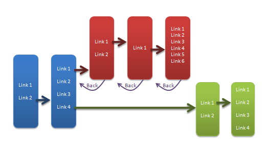
When I visit a site and navigate through some links I can use the ‘back’ button to go back in time and the ‘forward’ button to come forward again. However, if I go ‘back’ and then follow a new link the entire previous future is thrown away in place of the new future. In the graphic below the ‘red’ route (top) is completely forgotten.

Browser timeline

But what if just wanted to check a quick fact and then return to where I was? Yep… I have to go ‘back’ and then painstakingly retrace my previous steps one link at a time.

The same occurs when I open a link in a new tab… *bang* the history from the previous tab is not carried over… there is no way for me to find out how I came to have that tab open.

There is no real technical reason for this… computers are completely capable of remembering the full history (in fact it is little more than a simple tree) and also of copying it between tabs.

The ‘back’ button works well, but in my opinion the ‘forward’ button, and new link navigation behaviour is horribly broken.

The forward button should remember all the routes you have browsed and (whilst it may default to the most recent) should offer then the choice of which route to follow when going forward.

Putting it together

With those three thoughts formed it seems that they are a perfect match.

Jigsaw coming together

Imagine a world in which a browser stores our full history (not just the current timeline) with all the content of the pages, then when the user navigates away or changes tab also stores the current execution state of the scripts in the cache.

Suddenly our browser only has to run one set of scripts and keep one page loaded in memory at any given time. We can return at will to pages we have seen before regardless of whether we have an internet connection available, we can annotate and cross-reference pages, and we can implement a history browser that lets us see multiple navigation routes. We could even display the users history in a revision tree much like we use in version control.

Downsides

As with every idea this one is not without its downsides.

Chief among these are the lack of backward compatibility with the current browser model and plugins, but there are a bunch more:

  • Site owners would see a dramatic reduction in ‘hits’.
  • Advertisers would ship less ‘fresh’ adverts.
  • It would require a new UI to allow certain sites to be flagged as ‘background’ tasks (e.g. streaming audio sites, gmail) which would allow processing when hidden.
  • Users would probably need some kind of UI element reminding them that the content they were seeing was, possibly, not the most up-to-date content on the site.
  • There would need to be a clear separation of ‘upload’ and ‘download’ activities so that these did not get suspended by tab backgrounding (although I think for the most part browsers already do this).

Conclusion

I could see this being a much nicer web experience… but sadly inertia probably means it won’t come to pass.

see also

You must be logged in to post a comment.

community content (no approved comments so far)
Click to expand

Folders vs Labels
Click to expand

An endless gripe with Gmail has been that it uses labels in place of hierarchical folders to organise mail. This is great in some ways since we have all encountered the situation where a mail appears to belong in more than one folder, but irritating in that it isn’t possible to keep a nested set of categories for your mail.

Labs to the rescue

A recent ‘labs project’ from Google has attempted to solve this with the use of specially formatted labels – i.e. any label with a slash in it can appear like it is in a folder.

For example if we wanted a simple folder structure as follows:

We could create 4 labels:

  • People
  • People/Dave
  • People/John
  • People/Karren

And the Google “Nested Labels” Labs extension will make this show up as

Complete with the little collapse folder icon (which works) and all the expected label colours.

Seems like the problem has been solved wonderfully right? Wrong!

Fundamentals

Unfortunately this is what our American brothers would refer to as ‘lipstick on a pig’… it’s a cosmetic fix that does nothing to alleviate the fundamental problem.

Imagine if I rename the ‘People’ label to ‘Friends’…

Uh oh. That’s very unlikely to be the result I wanted and highlights the point that all this is still just visual trickery.

In addition if you have the option to display labels in front of all the e-mails you receive you will see the full label (folder, slashes, and all) on every e-mail.

So in my opinion this lab, although really handy, rather misses the point.

Sub-classification

What we are looking for is sub-classification and being able to treat groups of mails as if they were one item. This can, I think, be achieved in a relatively simple solution.

We need only get a little bit Meta on our labels. If we could apply labels to labels as well as to mail we would be sorted.

Imagine I have 10 mails labelled ‘John’ and 5 labelled ‘Mike’. Now all I have to do is create a ‘Friends’ label and apply that to the labels ‘John’ and ‘Mike’ and presto… all the benefits of folders with the added benefit that I could also label ‘John’ with a ‘Colleague’ label.

No mail duplication, no hard folders, multiple sub-categorisation, and the ability to manipulate mails as grouped items. Simple.

Going further

But why stop with mail? This can also be done for Contacts, Tasks, Documents, Events, etc.

In fact, why maintain separate sets of labels?

Imagine I have a group of Contacts called ‘Friends’ why do I need to manually create a label in my mail called ‘Friends’ and then create filters to add that label to all the mail from my friends?

It doesn’t seem a big step to have this label automatically applied.

And the benefit of a common label system? If one of my ‘friends’ becomes an ‘enemy’ then all the material related to that person moves automatically simplifying my filing and admin tasks.

Hiding via settings

Of course sometimes I will have labels related to one thing that I don’t want to show up everywhere – a common labels system could generate a lot of labels) – but as is already demonstrated in Gmail this is actually just a question of display and could be cleanly handled by extending the ability to ‘show/hide’ labels to the ability to ‘show/hide for each section’.

Auto filtering

Finally why can we only apply filters to mails? I should be able to set up filters for my documents, contacts, appointments, etc as well.

Imagine I’m working at a company (ABCorp) and I want to keep all the information about that company labelled together – it should be possible to create a filter that labels any item (document, mail, contact, etc) that contains the word ABCorp automatically.

So how do we make this?

At this point we have a unified simply filing system that fulfils all the benefits of labels, folders, filters and has none of the drawbacks.

Unfortunately it requires Google to modify their backend to allow application of labels to labels and it requires deep integration of their disparate services. This is no small UI fix.

I believe it is likely it could be done without breaking existing data but without access to Googles core systems it’s impossible to know.

So sadly… after you’ve slogged all the way down to here… this probably isn’t something we are going to see any time soon 🙁

see also

You must be logged in to post a comment.

community content (2 approved comments so far)
Click to expand
Design and Content © Copyright Duncan Kimpton 2010